

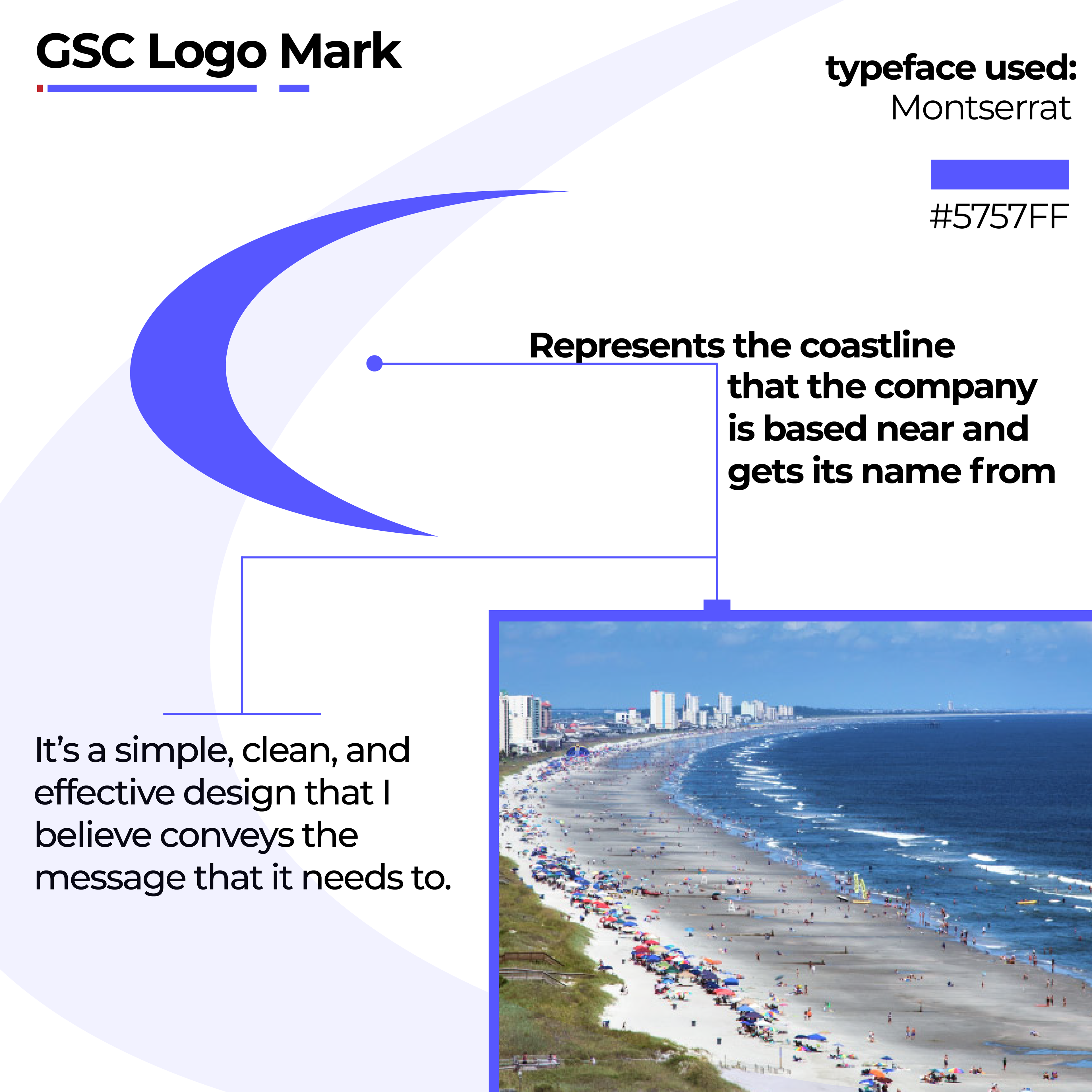
This is a branding project I completed for a local Myrtle Beach cleaning company. Starting with the Logo, I incorporated the shape of the actual "Grand Strand" coast into the logomark. I opted for a blue color to represent the ocean and to convey cleanliness, professionalism, trust, and calm.
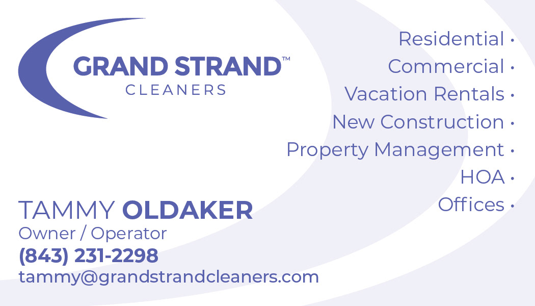

Moving on to the business card; I still wanted to communicate a feeling of tidiness. I didn't want too much going on or for it to be chaotic, but I did still want it to be eye-catching. I feel I achieved this with a somewhat minimal approach, with the swoosh of the logo on low opacity in the background to add visual interest.


Lastly we have the ad. It's meant to be more eye-grabbing; using elements like cleaning supplies in the background and imagery of the beach where the company gets its name.